
Shelter Box
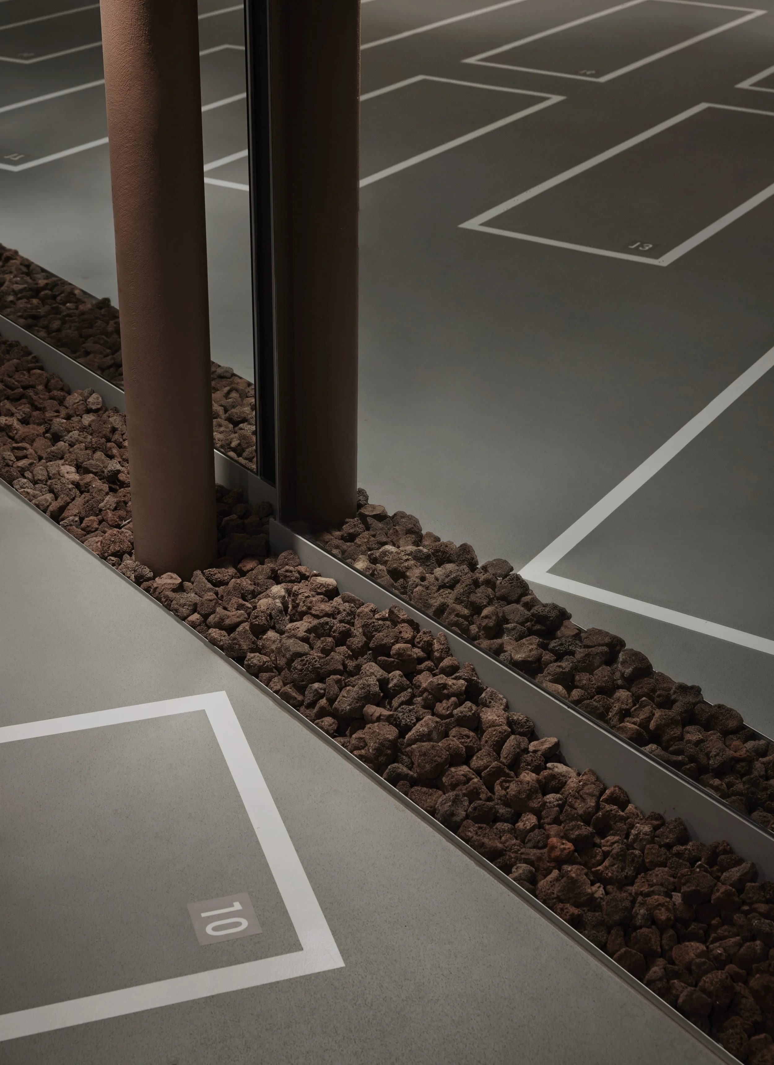
Inspired by the Australian landscape that compliments the lighter, more coastal vernacular of the first flagship Shelter. Burnt red tones (dusty sand) are set against an overwhelmingly grey backdrop. Considered and luxurious, our intention was to provide a space that sets itself apart from the gritty and aggressive, and remain true to the brand of feeling ‘like a spa, whilst working like a gym’.


We stripped back the existing tenancy to highlight the ‘bones’ of the concrete structure; sandblasting layers of paint from the concrete structural columns and leaving the existing ‘entrails’ of air conditioning ducts exposed.


Colouring was critical to unite spaces, create drama, and imprint a strong brand identity in the most cost efficient way. Space and material was used extremely economically, the only ‘folly’ - a tunnel to create a transportive ‘entry experience’.
